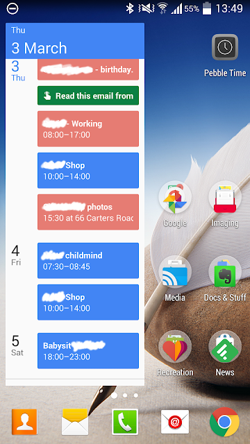
 The new Google Calendar has a clean and uncluttered design that some people may think looks a bit basic. The widget (shown here), for example, has no settings, it's simply a list of coloured cards - one for each calendar or reminder entry. This simplicity is carried through to the design of the main app which supports views for month, week, 3 day and day views. In addition, there is a 'schedule' view, which is basically a continuous list of event and reminder cards with day and date markers (similar to the widget). I find myself working in schedule view most of the time. A neat feature of all the views (on a phone) is the transition from holding the phone in portrait to landscape mode - whatever view you happen to be in in portrait, it switches to a week view in landscape - a nice quick way of getting to the week view.
A huge improvement is the integration of 'reminders' into the calendar. Reminders are not the same as the to-do items in Google's desktop calendar and won't appear in that list. Google has obviously decided to focus on a more generic reminder system that operates across platforms, devices and other apps. For example, you can set a reminder on a note in Google Keep, or an email in Inbox on your tablet, and it will magically appear as a reminder in Google Calendar on your phone. Neat. In fact, reminders are always in your face - they appear in Calendar, Inbox, and Google Now - no more forgetting! Google promises that reminders will also be coming to the desktop app soon, and I look forward to that.
Of course, all the normal settings for repeats on both events and reminders are available and new entries are made by touching the '+' badge that floats in the bottom right of the Calendar screen. All up, it's pretty obvious how things work and the app just gets out of the way and lets you get on with organising your life; something some of the other available calendar tools could well take note of.
So, if you need an excuse to have a drink, the new Google Calendar could be it. Cheers.
No comments:
Post a Comment